Visualizing Westminster
A look into the history of the college logo
by Anita Boeira (MPC ’10)
Over the past year, Westminster has undergone a brand overhaul to better reflect what the school is at its core. (Read more about our branding on page 32.) With the new branding came a new logo, which prompted the question: What is a logo, and what is the point of having one? Top logo designer Michael Bierut, whose work includes the Verizon, United Airlines, and Hillary Clinton logos, says, “It’s nothing inherent to the shape, but what the shape comes to represent in the minds of the people that are looking at them.” As Bierut suggests, a logo is the visual representation of an entity, and it must reflect what the institution represents, without necessarily having to tell the full story.
As the campus community moves forward with its new logo, we thought it would be fun to dig into the archives* and check out the many variations of Westminster’s logo over the years.
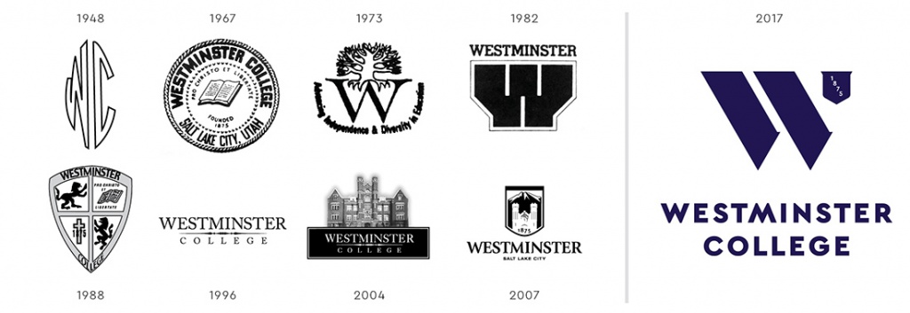
In 1948, the first pictorial representation of the college—a stylized WC—appeared on the commencement program. In 1967, the logo took on the form of an official seal, which received minor design updates in 1971. Westminster still uses that seal on diplomas and transcripts. In 1973 the college experimented with a new logo that was used only once. The one time use of a new logo happened again in 1982. The college shield—currently used on the Westminster license plates—first appeared as a logomark in 1988. In 1996, the college adopted its first wordmark logo (a word with no illustration), which was used until 2004, when the wordmark received an upgrade with the addition of Converse Hall above it. The last iteration of the Westminster logo—the shield with Converse and the Wasatch mountains—was designed and adopted by the college as part of its 2007 rebrand.
“Companies change their logos all the time to be reflective of changing times,” says marketing professor Nancy Panos Schmitt. “It can be a big deal to change, especially if people associate a logo with a product, and sometimes that new logo doesn’t match expectations because they may not understand some of the changes the company went through.”
At the end of the day, it might not matter what your logo is if the heart of the organization is not felt by those involved with it. “The idea is to think of those symbols as empty vessels, and then you pour the meaning into them,” Bierut is quoted as saying.
Nancy agrees: “You just see a little bit, and you visualize in your head what it all means. You don’t need to see anything else; you see the ‘W,’ and you know: that’s Westminster.”
The New Logo
Sixteen different logos were created by local creative agency Struck and then evaluated by an internal group of staff, faculty, and current students.
The four favorite logos were tested with prospective students and their parents.
There was one clear winner.
The new logo is formed by perfect 60-degree angles and isosceles triangles: an ideal balance of art and science.
The bold shape is intended to convey a forward-looking institution.
The shield contains the founding date to honor Westminster’s long tradition.
*The research for this article focused on official documents only, such as commencement programs and invitations, in the Giovale library archives.
About the Westminster Review
The Westminster Review is Westminster University’s bi-annual alumni magazine that is distributed to alumni and community members. Each issue aims to keep alumni updated on campus current events and highlights the accomplishments of current students, professors, and Westminster alum.
GET THE REVIEW IN PRINT STAY IN TOUCH SUBMIT YOUR STORY IDEA READ MORE WESTMINSTER STORIES
